This is a pattern about Classy HTML.
Classy

No, not THAT “Classy”. This “Classy”:
HTML

No, not THAT “HTML”. This HTML:
The Classy HTML Pattern
Pretty simple: Store important app state as classes in your root (“html”) element.
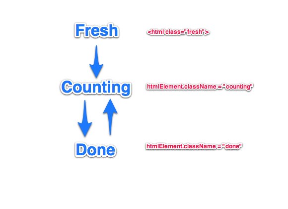
For example, consider a countdown app. Its significant (from a UI perspective) state can be summed up as being one of three things: “fresh” (app just started), “counting”, “done”. Your app is, in effect, a state machine transitioning between those states according to a set of rules. (Acknowledging that reality and subsequently managing those state transitions with JavaScript can also be an interesting problem ripe for a parsimonious design, but let’s just take that for granted here.)
You would set your HTML class as “fresh” to begin with, and then programmatically switch it over to “counting” or “done” as the app plays out.

Your CSS reflects it:
[css] /* We choose the default case to reflect the most common case, ie “counting” or “done” */ html.fresh .welcomeMessage { display: none; }
html.fresh { background: white; } html.fresh .counter { opacity: 0.3; }
html.done { background: red; } [/css]
The important thing here is the selector idiom, which can be summed up as “html.state descendentSelector”. We’re styling our classes all the way down, based on the overall application state.
I haven’t done too much of this kind of design, but I can see myself doing more of it as apps get more complex and everything becomes single-state. I’ve been contemplating refactoring the Hacker News Reader along these lines, since (thanks mostly to Paul), it now has sliding panels, and so can effectively be in three states: stories, story (one story above the list of stories), comments (comments above one story above the list of stories).
I guess all this is obvious to CSS design pros, i.e. it’s a natural consequence of the CSS model, but I’ve not thought about doing it much and I mainly got the idea from this FOUC trick, which uses this pattern, but in a very restricted and specific way. The main insight really is that single-page apps usually have a small number of key states which can affect the entire UI.
As with any good pattern, it raises further questions:
- Should you use “class” or an HTML5 custom “data-something” attributes. I think it’s in the spirit of HTML/CSS to use “class” to represent a state, so that’s fine. And CSS attribute-based support won’t work on older browsers, so that’s another tick for “class”. BUT custom attributes have the distinct advantage that you can be more precise about what kind of state you’re referring to. So while it could just be “data-state”, it could also be “data-phase” or (a boolean) “data-active”. Which takes us to the next question …
- Should you use more than one type of state? I think for complex apps, yes. And you can then use custom data attributes to manage the type of class. Or you could just use them as a list of free-floating class names on the HTML tag.
- Should you use multiple selectors, e.g. [data-phase=”counting”][data-authenticated=”false”] to be more precise? In general, I think no. It would lead to ridiculous combinatorial complexity, so it’s better to treat each state variable - if you must have more than one of them - as being orthogonal. That said, there are probably special cases where it makes sense and fortunately modern CSS makes it easy to pull off.
- What’s the base case? Should it be the initial state or the “typical” state?
- Looking at the bigger picture, when do you switch pages versus switch states inside the app?


