Some web apps on the store are promoting their web app to users visiting from Chrome, in the same way we sometimes see “Try our mobile app!” links. Why would you do this, when the user has already visited the app from a regular website? Mostly because if a user installs the app, they’re likely to keep coming back, given that it’s easily accessible from the New Tab Page. In addition, installed apps have extra powers: in-app payments (coming soon), background apps, and - in the case of packaged apps - extension capabilities. It will also help the app’s landing page on the store if happy users are leaving positive reviews.
I see all this as progressive enhancement. Each app platform has its own capabilities, some are not (yet) standard, but still expected by users. So make a normal web page that rocks, then make it rock harder for specific platforms. And let people know about it.
One size fits all? Nup. Here’s a little gallery of four sites I know who are doing this, all in different ways?
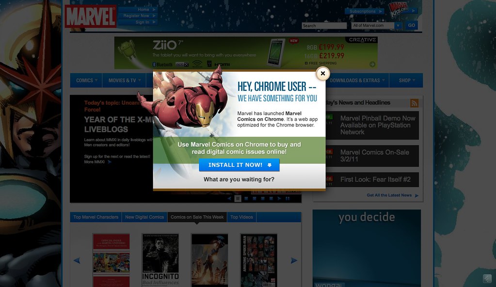
Marvel goes all-out with lightbox on entry:

HuffPo has a “Try Newsglide” message above its header:

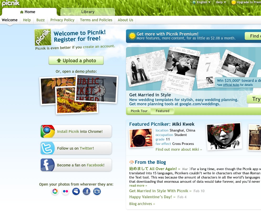
Picnik has an “Install Picnik into Chrome” alongside Twitter and Facebook buttons:

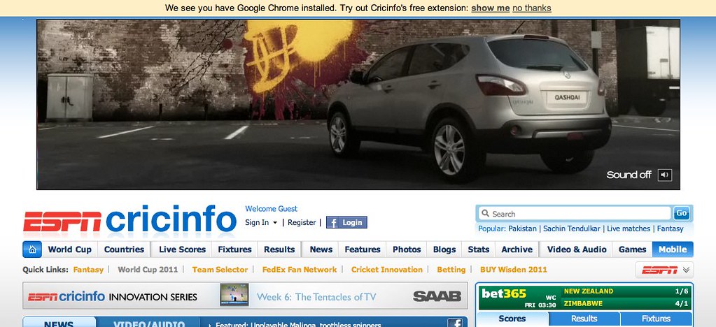
CricInfo has an infobar on top of the page:


